The day-one photo lies
The short answer: almost every tattoo photo you see was taken minutes after the session, on wet, red, swollen skin under good light. That's the best the tattoo will ever look. Healing grows a fresh layer of skin over the ink, so blacks come out slightly softer, color slightly muted, and the finest lines a little blurrier, and that's before years of aging start. So judge artists by their healed work, and design for the healed version: strong contrast, real space between lines, nothing that only works at full saturation.
Scroll any tattoo feed and you're looking at a highlight reel of a single moment. The artist wipes the piece down, maybe adds a thin layer of ointment, puts it under the shop lights and takes the photo. It's the honest proud moment of finishing a piece, and it's also a record of a tattoo nobody will ever see again.
That matters because those photos are what people design from. You save a fresh piece, you bring it to an artist, and you're asking for something that, by definition, doesn't last past the first week.
What the fresh photo is actually showing you
Shine. A fresh tattoo is wet, either from ointment or from the plasma the skin is still weeping. Gloss deepens dark tones and makes color look jewel-like, the same way a wet stone looks richer than a dry one.
Contrast that's borrowed from inflammation. Freshly tattooed skin is red and puffy. Lines can sit slightly raised, which gives them crisp edges and a little shadow. Black against irritated skin reads sharper than black against calm skin.
Ink with nothing on top of it. On day one the surface of the skin is broken, so you're seeing the pigment more directly than you ever will again.
The best light and the best angle. The photo is framed by the person who made the work. It's often edited too, for contrast or color. Nothing sinister about that. It's a portfolio shot, but it isn't a forecast.
What healing does to it
Over the first few weeks the skin closes over the ink. It flakes and peels, and there's usually a cloudy, milky-looking stage where the new layer is forming and the tattoo seems dull. Most of that clears. But when it's settled, usually after a month or two, you're looking at the ink through a thin layer of new skin, and that layer works like a slightly frosted window.
- Black looks a little less inky and a little more charcoal.
- Color loses some of the day-one punch. Pale tones, pastels and white highlights soften the most.
- The very finest lines and smallest gaps get a touch softer at the edges.
- Some ink can fall out unevenly while it heals, which is why many artists offer a touch-up once it's settled.
A well-made, well-healed tattoo still looks great. It just looks like a tattoo in skin rather than a wet drawing. Then the slow part begins: ink spreads microscopically and UV breaks pigment down over years. That long tail is covered properly in how do tattoos age. The point here is that the gap starts before the year-one mark, not after it.
Read a portfolio like a skeptic
The most useful thing you can do with all this is change what you look at when choosing an artist. A fresh photo shows you the drawing and the stencil. A healed photo shows you the tattooing: whether lines went in at a consistent depth, whether blacks packed solid, whether color held.
- Learn the tells. Fresh: redness around the edges, shine, plastic film, puffy raised lines. Healed: matte surface, visible skin texture and pores, hair growing through, no halo.
- Look for healed work in your style. Healed bold work proves little about an artist's fine line, and the gap between fresh and healed is widest in delicate and soft-shaded styles. See do fine line tattoos age well and realism tattoos.
- Ask. If a portfolio is all fresh shots, ask to see healed ones. Good artists usually have them and are glad to show them.
Use those healed photos to judge the artist, not as a design to copy. The piece in someone else's portfolio is their work on someone else's body. Bring your own idea, which is the argument in AI isn't replacing your tattoo artist.
Design for the healed version
If healing softens everything a little, the design has to have something to spare. Three things decide whether it does.
Contrast in value, not just hue. Two colors that are different hues but similar lightness, like a mid red next to a mid green, separate well on a screen and blur together in healed skin. Dark against light survives. A design that still reads in black and white will still read healed.
Space between things. Gaps are what keep shapes apart once edges soften. A hairline gap is a promise the skin can't keep for long, while a generous one has room to lose a little. This is why detail-heavy ideas belong at larger sizes. More on that in small tattoos that age well.
A structure that doesn't need color. Bold outlines and solid black give the piece a skeleton. If the color softens, the shape is still there.
Your mockup is a day-one photo too
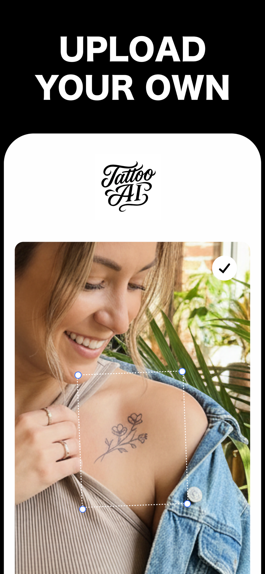
Here's the honest limit of a try-on, ours included. A preview in Tattoo AI shows you the design crisp, at full contrast, sitting on your photo. It's great for size, placement and whether you actually like the idea on your body. It doesn't simulate healing or aging. In that sense it flatters the design just like a fresh photo does.
So stress-test it. Once the design is placed at true size, look at the preview zoomed out, at arm's length, and squint. If lines crowd each other or two areas merge into one shape, assume healed skin will do the same thing, only more. Simplify, open up the spacing, push the contrast, and check again. Then live with it for a while, which is the whole method in the boredom test. Getting this wrong after the fact is expensive, as the cover-up tax explains.
Fall for the healed version
The fresh photo is the tattoo's best day. You'll be wearing every day after it. Pick the artist whose healed work you'd be happy to have, and the design that still works when it's a little softer than it is now.
Free on the App Store · iPhone & iPad