Flat art, round body
The short answer: every tattoo is designed on a flat surface and worn on a curved one. A limb is closer to a cylinder than a page, so only a narrow band of the design ever faces you at once — the rest bends away, foreshortens, and disappears around the side. That's why a design that looked perfect on a screen can read as squashed, tilted, or lopsided on an arm. Good artists solve it by drawing on you, not on paper. You can solve half of it before the appointment by looking at the design on your own body instead of on a flat canvas.
Here's a thing nobody warns you about. You spend two weeks getting a design exactly right. Every line is where you want it. Then it goes on your forearm and something is off — not wrong, exactly, just not the thing you fell in love with. The symmetry you liked reads crooked. The wide composition looks cramped. You can't put your finger on it, so you assume the artist changed something.
They probably didn't. Geometry did.
A page is flat. You are a stack of cylinders.
Think about what a forearm actually is: a tapered cylinder that rotates, roughly three inches across at the wrist and four or five at the elbow. Stand in front of a mirror and you see maybe 120 degrees of it. The other two-thirds of that surface exists, holds ink, and is invisible from where you're standing.
A drawing doesn't have that problem. Every square inch of a page faces you equally. So when you judge a design flat, you're judging a version of it that will never exist once it's on skin — one where nothing curves away and everything is visible at once.
The effects are consistent enough to name:
- Horizontal compression. Width shrinks as it wraps. A design that's four inches wide on a screen occupies noticeably less apparent width on a four-inch-wide arm, because the outer edges are turning away from you. Height is untouched. So wide designs get subtly squashed and tall ones don't.
- Broken symmetry. A mirrored design only reads as mirrored if its center line sits exactly on the high point of the curve. Off by half an inch and one half foreshortens more than the other. Your eye catches this immediately and reads it as "crooked" without knowing why.
- Edges that vanish. Anything more than about sixty degrees off center is basically gone from a straight-on view. Detail placed there is detail you paid for and won't see.
- Motion. A page holds still. A bicep changes shape between relaxed and flexed, and a design across a joint stretches every time you bend it.
This is what stencils are for
The stencil isn't a formality before the real work — it's the step where the flat drawing gets negotiated with an actual body. That's why an artist will place it, have you stand up, look at it from across the room, peel it off, and do it again. They're not being fussy. They're checking what the design does when it's on a curve and you're moving.
It's also why experienced tattooers often adjust a design at the shop in ways that look arbitrary on paper. Widening a gap so it doesn't close up where the arm turns. Rotating a piece a few degrees so its axis follows the limb rather than the floor. Dropping a detail that would have landed on the far side of the curve. Each of those is a fix for a problem the flat drawing couldn't show.
Why traditional styles hold up so well on bodies
Once you're thinking in curves, a lot of tattoo convention stops looking like aesthetics and starts looking like engineering.
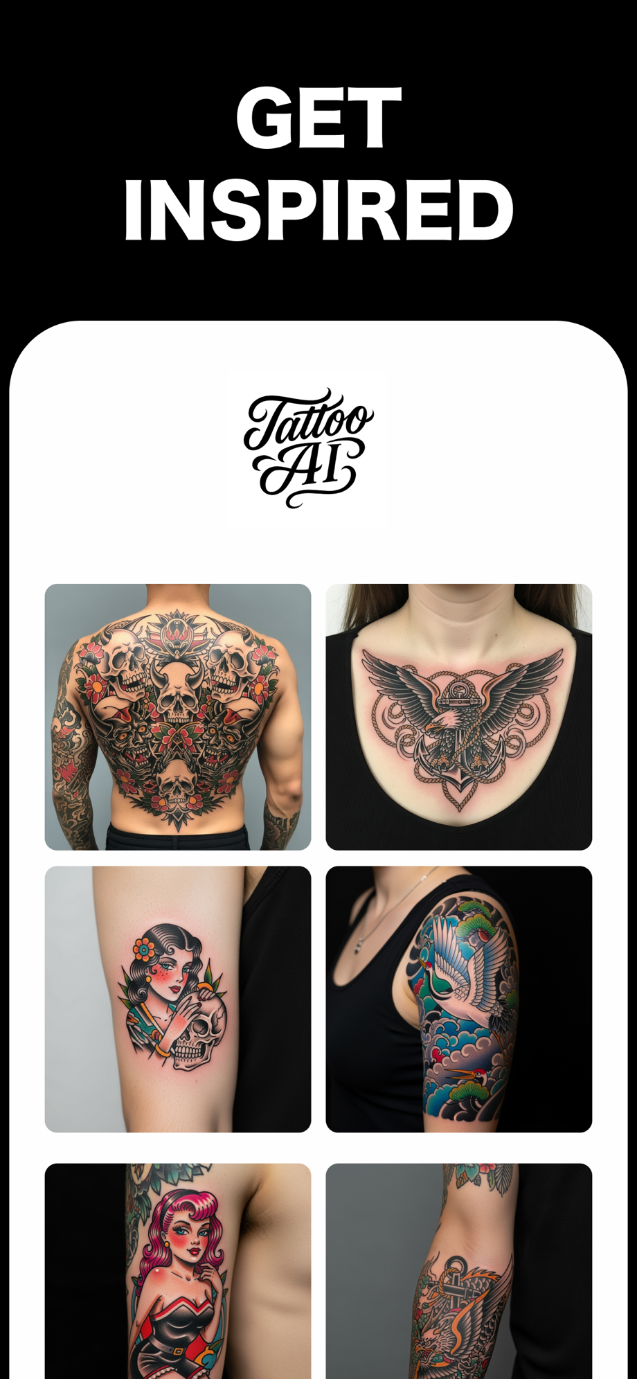
Bold outlines survive because a heavy line still reads as a line when it's foreshortened to half its width. Delicate hairlines don't — compress a one-millimeter line and it disappears into the skin's own texture. Traditional and Japanese work uses long flowing shapes because a shape that runs along a limb barely foreshortens at all, while a shape that runs across it eats the compression head-on. Black background and negative space do real work here too: they give the eye an edge to hold onto as the piece turns away.
None of that is nostalgia. Those styles were refined on bodies over a century, by people watching what survived. Our styles guide covers what each one is good at, and how tattoos age covers the other half of the durability question — what time does after geometry is finished with it.
What you can actually do about it
- Judge the design on your body, not on a canvas. This is the whole point. A design sized onto a photo of your actual arm shows you the compression, the axis, and the real scale in one look. Flat previews hide all three.
- Check it from an angle, not just straight on. Straight-on is the flattering view and the one you'll almost never be seen from. Look at it the way someone standing next to you would.
- Find the high point of the curve and put your center line there. For symmetric designs, this is the single highest-leverage decision. It's also the one artists most often correct at stencil time.
- Follow the limb's axis, not gravity. Designs that run with the length of an arm or leg read cleaner and distort less than ones pinned to a horizontal.
- Push detail toward the center. Fine work near the outer edges is work you're funding and won't see. Give the middle band the detail and let the edges carry weight instead.
- Move it and look again. If it crosses a joint, bend the joint. That's a preview you can only get on a real body.
Where a preview stops helping
Be honest about the ceiling. A photo preview is still a photograph — it's a flat image of a curved thing, so it captures foreshortening and scale but not how the piece behaves as you turn, flex, and walk around. It doesn't know your muscle structure. It can't tell you how a line will spread over fifteen years. And it has no opinion about what's already tattooed nearby.
What it does is kill the biggest and most expensive category of mistake — wrong size, wrong axis, wrong spot — before you've booked anything. The rest belongs to your artist, standing in front of you with a stencil. Bring them the sized photo along with the design; that's the brief that actually helps them.
The honest framing
Most tattoo regret doesn't come from choosing the wrong subject. People rarely stop loving butterflies or their grandmother's handwriting. It comes from size, placement, and detail that couldn't survive the trip from a flat drawing onto a round body.
That trip is the part of the process worth being obsessive about, and it's the part that's easiest to check. Look at the thing on your own arm before anyone gets paid.
Free on the App Store · iPhone & iPad