We generated the same tattoo idea 50 times. Here's what changed.
The short answer: across fifty runs of one prompt, the subject stayed rock solid and almost everything else moved — composition, density, orientation, and how much negative space the design left. The lesson: describe the things you'd be upset to lose, especially shape and framing, and leave the rest open. Vague prompts don't produce bad designs; they produce fifty different good designs, only one of which is yours.
We ran an experiment on ourselves. One prompt — "a wolf howling with pine trees behind it" — generated fifty times, no other changes. Same style setting, same everything. Then we laid all fifty out side by side to see what the description actually locked in and what it left to chance.
What stayed the same in all 50
The subject never wavered. Every single generation had a wolf and it had pine trees. Nouns are the strongest thing in a tattoo prompt — if you name a concrete object, you get that object, every time. Nobody got a fox. Nobody got oaks.
The declared style also held completely. All fifty read as the same family of linework, because style was explicitly selected rather than described in the text. That's the pattern: the more explicitly a thing is specified, the less it drifts.
What changed wildly
Composition. This was the biggest variable by a mile. Some runs put the wolf in front of the trees. Some framed the wolf's head inside a circle of trees. Some stacked them vertically, some spread them horizontally. A handful put the wolf in profile against a moon we never asked for.
Aspect ratio and flow. Roughly a third came out tall and narrow — good for a spine or a calf. Another third came out wide — good for a chest or across the shoulders. The rest were roughly square. We never said which we wanted, so we got all three.
Ink density. Some designs were airy, mostly line, with a lot of open skin. Others were nearly solid black. These are wildly different tattoos to actually get — different session lengths, different prices, different aging behavior — and the prompt said nothing about it.
Detail level. Related but distinct: a few generations rendered individual pine needles. Others reduced the trees to five silhouette shapes. The simplified ones would tattoo beautifully at four inches. The detailed ones needed twelve.
The three words that fixed almost everything
We reran the experiment with a tighter prompt: "a wolf howling with pine trees behind it, vertical composition, bold outlines, lots of open space."
Fifty more runs. This time the variance collapsed. Nearly all of them were tall, most were line-forward, and the compositions were recognizably siblings instead of strangers. Three added phrases — orientation, line weight, density — did more than any amount of adjective-stacking on the subject itself.
That maps exactly onto how tattooers think. An artist doesn't need you to describe the wolf's expression. They need to know how big, what shape, how bold, and how much skin you want left showing.
How to write a tattoo prompt that gets you your tattoo
- Name the subject plainly. "A wolf and pine trees." Don't dress it up — extra adjectives on the subject barely move the result.
- Say the shape. Vertical, horizontal, circular, or "fits a forearm." This is the single highest-leverage word in the whole prompt.
- Say the line weight. "Bold outlines" or "fine single-needle lines." This decides how the piece ages more than anything else you'll type.
- Say the density. "Lots of open space" or "heavy black fill." This decides your price and your session count.
- Pick the style from the list, don't describe it. An explicit style selection holds far better than the word "traditional" buried in a sentence.
- Then generate several and compare. Even a tight prompt has range, and the range is useful — you're picking from options, not commissioning one shot.
The counterintuitive finding
The best design in the first fifty — the one we all picked — was one nobody would have prompted for. It framed the wolf's head inside a ring of trees, an idea that wasn't in our heads when we typed the prompt.
So the practical workflow is two-phase, not one. Start loose and generate broadly to discover compositions you wouldn't have asked for. Once something clicks, tighten the prompt around that and generate again to refine it. Precision too early just gets you a well-executed version of your first idea, which is rarely your best one.
Try it yourself
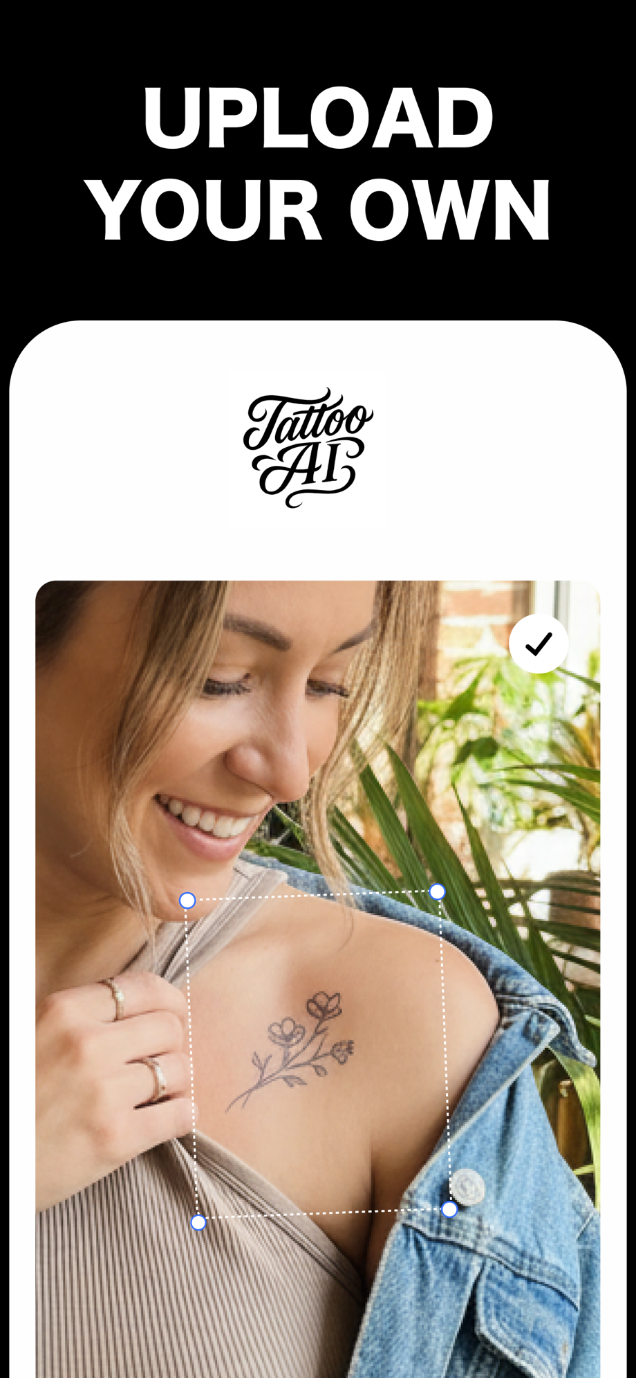
Tattoo AI is free, so running your own version of this experiment costs nothing but time. Type your idea once, generate a batch, and watch what drifts. Then place the winner on a photo of the spot you're actually considering — the composition that looked best on screen isn't always the one that fits your arm.
Free on the App Store · iPhone & iPad