What is American Traditional tattoo style?
The short answer: American Traditional is the classic Western tattoo style — bold black outlines, a limited saturated palette of red, yellow, green, and black, heavy black shading, and iconic flash imagery like eagles, panthers, roses, daggers, and swallows. It's also the longest-lasting style there is: those thick outlines tolerate decades of ink spread, so bold work holds for decades where delicate styles soften in years.
Where it comes from, briefly
American Traditional was forged in port cities and Navy towns in the early-to-mid 1900s, codified by artists like Sailor Jerry Collins in Honolulu. Sailors picked designs off pre-drawn flash sheets on the wall — which is why the imagery is so consistent, and why a Traditional piece done today still connects to a century of the same eagles and swallows. That's the history. The rules are what matter for your tattoo.
The rules that define the style
- Bold black outlines. Thick, confident, unbroken. The outline is the skeleton — everything else hangs on it.
- Limited saturated palette. Red, yellow, green, black, sometimes a muted blue or brown. No gradients, no pastels. Colors are packed solid.
- Heavy black shading. Black does the dimensional work — whip shading and solid black fields give the piece weight.
- Iconic subjects. Eagles, panthers, roses, daggers, swallows, pin-ups, ships, anchors, snakes, hearts. Each carries meaning built over a century of flash.
- Readable at a distance. A Traditional piece should read instantly from across the room. If it needs a close look to parse, it's breaking the style.
Why it ages better than every other style
Ink particles migrate microscopically in the dermis over decades — every tattoo spreads. A 3–4mm Traditional outline can absorb that spread and still read perfectly. A sub-millimeter fine line can't; fine line work holds crisp for 5–10 years, then softens. Solid color fields fade slower than gradients, and heavy black shading is the most stable ink in the skin.
This isn't an accident. The style evolved on sailors whose tattoos took sun, salt, and decades of hard living. Everything fragile got selected out. What survived is a formula engineered for permanence — which is exactly what you want in a permanent medium.
Who it suits
You, if you want a tattoo that looks like a tattoo. Traditional suits people who like classic imagery, want strong visual impact, and care about how the piece reads in 30 years, not just on day one. It's a great first-tattoo style: forgiving to heal, proven to last, and nearly every good shop has someone who does it well. It's the wrong choice if you want photorealism, soft delicacy, or a subject with no flash tradition behind it — that's Neo Traditional or Realism territory.
Common mistakes
- Thin-lining a Traditional design. The most common request and the worst one. Fine outlines on flash imagery kills the whole mechanism — you lose the boldness that makes it read and the ink mass that makes it last. If you want delicate, pick a fine line design instead; don't dilute a Traditional one.
- Going too small. Traditional needs room for the black to breathe. A palm-sized minimum for most flash subjects; shrink it and the shading closes up within a few years.
- Adding too many colors. Six-color "Traditional" isn't Traditional. The limited palette is doing structural work.
- Overcrowding the design. Classic flash uses negative skin as part of the composition. Filling every gap ages badly.
See Traditional flash on your own body first
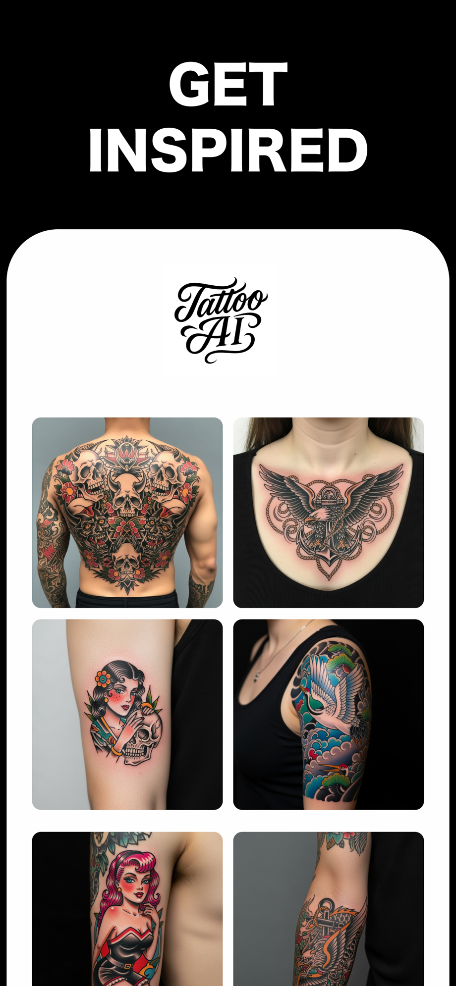
Traditional lives or dies at proper scale — a chest eagle needs a chest, a panther needs a full upper arm. Preview it at real size with Tattoo AI before you book:
- Generate Traditional flash for your subject — describe it ("eagle with spread wings," "panther head with dagger") and pick the Traditional style. The AI drafts it with proper bold outlines and the classic palette.
- Upload a photo of your arm, chest, or leg — the actual spot you're considering.
- Place it at honest scale — resize and rotate until it sits the way flash is meant to sit. If you keep shrinking it to make it "subtle," that's your sign the style or the spot is wrong.
- Compare placements — the same eagle reads differently on a chest vs a forearm. Try both photos and pick with your eyes, not your imagination.
Free on the App Store · iPhone & iPad